In case you're wondering what the Media Unit looks like with all the gear installed...herewith a little pic. The two big spaces are now filled with equipment assorted on 6mm smoke glass shelves so that the access holes at the back can no longer be seen. (The glare in the TV screen is generated by the lights, which unfortunately I can't do very much about)

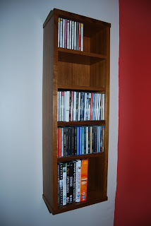
But in addition to that, I also ran up a simple unit to hold DVD's and CD's out of a few odd scabby bits of mdf that were loafing around the 'shop. As I've got acres of teak veneer and plenty of bits to use for the lipping, this little job turned out quite well for an absolutely minimum outlay, which, being a parsimonious sort of soul, I found quite agreeable...


3 comments:
I have never been enamored with heavier furniture design, always preferring softer grains and thinner material. This piece, however, has caused me to reconsider that trend as it is beautifully proportioned and accented. The feature I find so brilliant is how the equipment it was made to hold actually add to its overall aesthetics. There is no need for smoked glass doors here.
Well done, sir. Very well done.
Great job. Enjoy!
Did you really make all those things? I looks so professionally made... very need and elegant. But what a feeling having your work installed all over your house and being used. I think the feeling is so overwhelming and so inspiring to create another.
Post a Comment